By Miles Sellyn, VP of Strategy
Week two of Saidwell. You came back! Love that for us.
Quick recap for anyone who skipped last Thursday (rude, but fine): Jefferson Fisher's brief was clear, and our job was making it focused enough to launch well.
This week is about the first material visual design decision we needed to make on Saidwell, and considering how good it looks, perhaps we made the right one? Read on to find out.
What you’ll find below:
- The deadline that changed the way we needed to work
- The homework we gave the client
- Why "separately" was a critical term
- 11 questions you can steal / borrow / rent
More than one voice in the room
A very common situation in almost every design project, particularly with brand, is that there can be more than one person with significant input on the brand. In this case, Jefferson is the face of Saidwell, but Grant runs the business. Both had real opinions on how it should look from very different perspectives inside of the business.
Again, that’s pretty much every client team we work with. There’s a founder, an operator, someone who owns marketing, and occasionally someone’s cofounder who “just has one small note.” (If you aren’t sure if you have that person, you might be that person.)
More voices isn’t the problem. Hearing them all at the same time, three rounds deep, is - so often we engineer a process to avoid that situation.
On Saidwell, timing created a forcing function here. The visual direction had to be settled early, because everything else got designed on top of it: the product screens, the marketing page, the assessment. And all of that had to be ready for the beta.
So there was no room for three rounds of “can we see a few more options?”
The homework
Before we designed anything, our design team sent over a gut-check questionnaire. Eleven scales, each with a visual at both ends. The client team then marked where they landed.
Not an uncommon practice! But to make this work, we did one little tweak:
Jefferson filled it in. Grant filled it in. Separately.
In this scenario, it made all the difference in how we were able to align on design.
When two people answer together, you get the answer of whoever talks first. When they answer apart, you get a map. Where they agree, you design with confidence! That is the easy part. But where they don't, this approach enables you to have that conversation now, while it's a dot on a scale and not a logo someone's already emotionally attached to (which then blows your timeline).
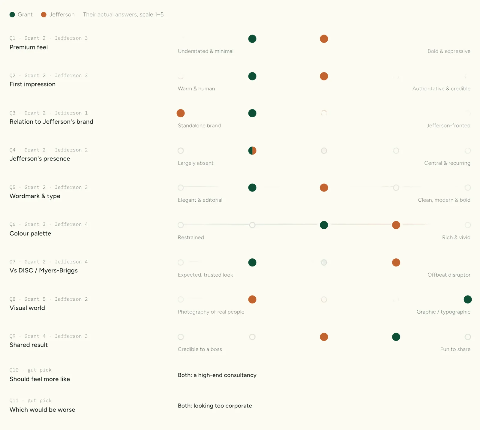
Disagreeing on a worksheet is waaaaay cheaper than disagreeing in round three of feedback.
The 11 questions
So here they are. Steal our homework! Swap in your own details where necessary, as some of this is specific to Jefferson’s space and Saidwell as a product.
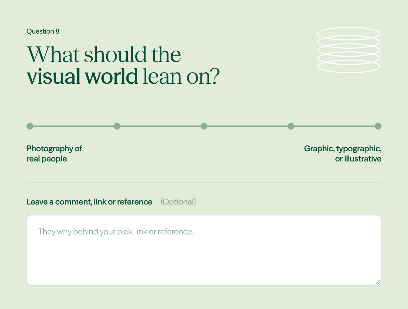
- Understated or bold?
- Warm or authoritative?
- A standalone brand that Jefferson endorses, or a product fronted by Jefferson?
- How present should his face be?
- Serif or sans?
- Restrained color or rich color?
- Should it look like a trusted assessment (think DISC or Myers-Briggs), or a disruptor?
- Photography or graphic?
- A result that's credible to your boss, or one that's fun to share?
- High-end consultancy or sharp tech app?
- Which would be worse: too corporate or too casual?
If you only steal one, try out #11. People are generally quite bad at describing what they want. They're great at describing what they'd hate!
What the answers turned into
"The worst thing it could be was too corporate."
That was one of the big things that came out of this exercise with Saidwell, and it tracked with who we expected to be the buyer.
At launch, most of Saidwell's customers were coming from social, on their phones. Long term, the plan is growing into a more B2B approach. So the identity had to feel personal enough for one person scrolling at 11pm and serious enough for an HR team later, without ever tipping into corporate stuffiness.
From there, things moved fast and a few key aspects influenced the ultimate visual identity:
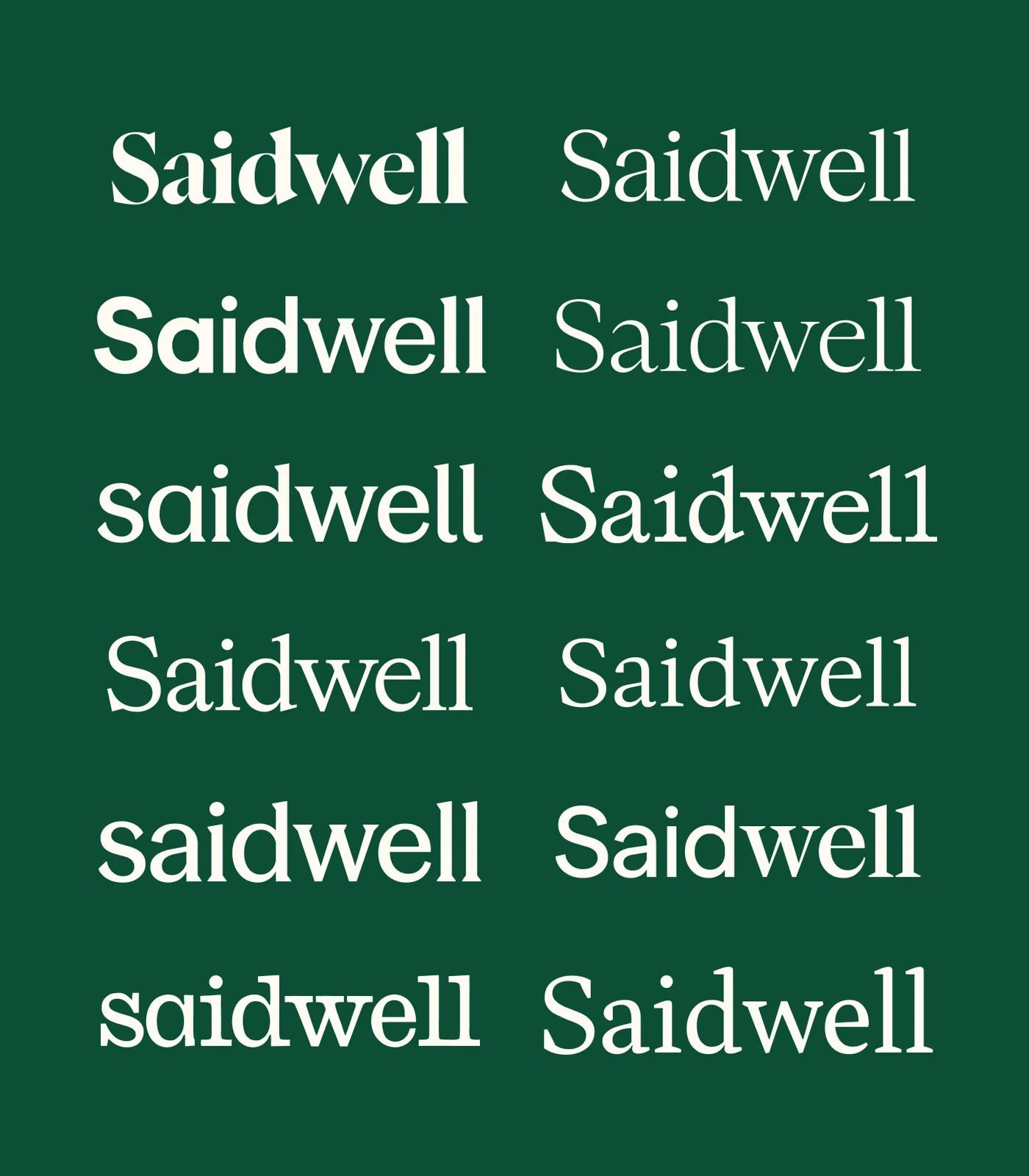
Type does the talking. It shifts from sans to serif and from light to heavy to show change: you handled a conversation one way, learned something, and handled it better next time. It also pulls the right word out of a sentence.
A color nobody else had. We looked at competitors' colors and why they picked them, then landed in a space none of them were using.
The questionnaire didn't make the decisions for us, but it gave us more information and a mechanism to discuss it with the client team, which ultimately just meant nobody was surprised by them. Generally, surprises in this kind of work are a bad thing.
That's it for today - I’ll be back next week with issue #3 about Saidwell…from a hotel room in NYC, where I’ll be attending the ElevenLabs Summit!