Small Pricing Tweaks Can Unlock Big Gains
Many subscription products struggle to convert users from monthly to annual plans, even when the annual option offers clear savings. Often, the issue is not pricing itself, but how that pricing is presented at key decision points.
This pattern surfaced while working through a strategy review with a Rare Days client who operates a highly successful fitness app. The product was roughly six months post-launch, with strong engagement, happy members sharing wins, and healthy MRR and ARR. The business was already working well, which made this an ideal moment to focus on optimization rather than major changes.
As part of an analytics evolution Rare Days was supporting, two signals stood out in the payment and checkout flow:
- Users were selecting monthly plans at a noticeably higher rate than annual
- Annual plans were converting at a lower rate than expected
This was not a risk to the business. However, small adjustments here had the potential to unlock disproportionate upside.
Why Percentage-Based Savings Often Undermine Conversions
Thousands of members had already signed up through this flow, so it was not broken. The opportunity sat squarely in refinement.
Data showed that the gap between monthly and annual selection widened at the payment screen. Users who reached checkout were seeing an annual price around $150 and choosing monthly instead.
This happened despite the fact that both plans included a 7-day free trial and the annual option effectively offered four months free compared to monthly pricing. On paper, the value was obvious.
The issue was not risk. It was cognition.
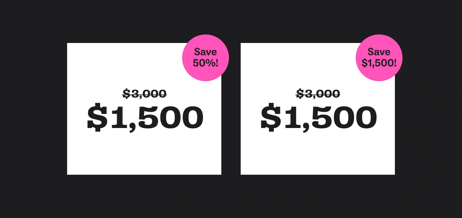
People tend to struggle with percentage-based calculations but respond well to concrete dollar comparisons, especially as the absolute price increases. When a user sees “Save X%,” they are being asked to do mental math at the exact moment they are deciding whether to commit.
For example, a $3,000 product discounted by 50 percent sounds good, but a $1,500 discount is immediately understood. One requires calculation. The other does not.
In this case, the annual price appeared on the payment screen without visible monthly context. Without that comparison, the number felt large in isolation, even though it represented strong value.

Where Annual Subscribers Are Commonly Lost
This type of drop-off typically occurs at two distinct moments, each driven by a different cognitive barrier.
Barrier 1: The pricing selection page
When users land on a pricing page, they make a rapid assessment. Monthly pricing feels familiar and easy to budget. Annual pricing feels like commitment, even when a free trial removes real risk.
When annual savings are communicated primarily as a percentage, users are prompted to calculate value themselves. Many choose the simpler option instead, not because it is better, but because it requires less mental effort.
Barrier 2: Loss of context at the payment screen
Even users who initially select annual can encounter friction later. When the payment screen displays the annual price without a monthly comparison, the perceived value disappears.
This is where abandonment often increases. The isolated price creates doubt. Users pause to reconsider or leave to double-check, sometimes exiting the flow entirely.

Five Pricing Optimizations That Improve Annual Conversions
The goal of these changes is not persuasion, but clarity. Value should be obvious without requiring effort.
1. Replace percentage savings with dollar amounts
Dollar savings are tangible and require no mental math. A figure like $85 is easy to visualize and contextualize.
2. Frame savings in terms of time
Positioning the annual plan as “four months free” reframes the benefit as time gained rather than money saved. This tends to be easier to understand and more compelling.
3. Show the annualized cost of monthly plans
Displaying the yearly cost next to the monthly price makes comparisons effortless. Savings become obvious without explanation.
4. Add social proof to the annual plan
If annual is already the most popular option, labeling it as such reduces decision anxiety. Social proof reassures users when they are uncertain.
5. Reinforce savings at the payment screen
A simple reminder like “You are saving $85 this year compared to monthly” preserves context at the moment of commitment, where it is most likely to be lost.
Recovering Revenue From Monthly Subscribers
When annual pricing offers clear value, there is often an opportunity to convert engaged monthly users before they pass the free trial window.
One approach is to target monthly subscribers who demonstrate meaningful engagement, such as multiple sessions, key feature usage, or time invested. The messaging focuses on value and certainty rather than price.
Instead of emphasizing savings alone, the framing highlights locking in a rate and removing the need to revisit the decision every month. This aligns the upgrade with confidence and long-term commitment rather than urgency.
The Practical Takeaway
Small changes in pricing presentation can unlock meaningful gains without altering the product itself. In many cases, the issue is not value delivery, but how that value is communicated at moments of decision.
For creator-led subscription products, the takeaway is straightforward:
- Reduce cognitive load wherever possible
- Make comparisons effortless
- Reinforce value when context is most likely to disappear
The difference between monthly and annual adoption is often less about willingness to pay and more about how clearly the decision is framed.


